We put Parsa to the test against Claude Code
The question we hear most often in customer conversations is simple: why can’t we point Claude Code or Codex at the same dataset and ask it to find the insights?
It is a fair question. Give a coding agent a CSV and an objective, and it can inspect the data, write code, identify patterns, and return something that looks remarkably close to a finished analysis.
So we put that question to the test.
We took 1,000 Etsy reviews from a personalized-jewelry seller and ran the same task through Claude Code’s agentic workflow and through Parsa. The objective was to identify the five most common topics, break each into four subtopics, assign one of those 20 labels to every review, and count the results so we could understand the main positive and negative drivers and identify opportunities for improvement.
For Claude Code, we deliberately kept the instruction at the level a customer might: here is the dataset, and here is the outcome we need. Determine the approach and go to work.
The first results were convincing. Actually, very convincing.
That impression held right up until we looked at how the numbers were actually produced.
Executive summary
The output passed the eye test. The process did not.
- →Only about 10% of the data was ever read. The agent read roughly a tenth of the reviews to design the taxonomy and write the rules that would label the dataset. The rest were never individually read.
- →A keyword classifier labeled every row, not a model. Rather than use the LLM to read and reason about each review, Claude judged that the expensive option and built a crude text-matching classifier, assigning labels by keywords instead of understanding.
- →Keeping that classifier accurate never ends. Every new way a customer phrases something means chasing the missed synonym and hand-coding another rule, repeated each time the data changes.
- →The reported counts do not match the underlying reviews. The percentages come from the classifier’s labels, and a meaningful share of those labels are incorrect. The totals therefore misstate what customers actually said, with no indication in the output that they are off.
- →Confident output, unverified underneath. An executive making a budget or product call on it would be deciding on incorrect data, with no signal the numbers were unreliable.
The test and Claude’s approach
This is the exact prompt we gave the agent. No methodology, no constraints, just the outcome a customer would ask for:
I’ve uploaded a CSV of 1,000 customer reviews from our Etsy shop. We sell personalized, handmade jewelry, and the reviews come from buyers across a few different languages.
I want to understand what customers are actually talking about. Read through the reviews, find the 5 most common topics, then break each one into 4 subtopics, 20 labels in total. Assign the best-fit label to every review, and give me the counts for each so I can see the main positive and negative drivers and where we could improve.
Claude began in exactly the way you would hope. It read every low-star review and sampled the higher-rated ones, around 120 reviews in total, profiling the vocabulary, recognizing that the seller specialized in personalized jewelry, and detecting reviews written in English, Spanish, and French.
From that exploration, it created a sensible five-topic taxonomy: Product Quality & Craftsmanship, Product Appearance & Design, Shipping & Delivery, Seller & Customer Service, and Gifting & Occasions. It then divided each topic into four subtopics, giving us the requested 20 labels.
Review Classification Taxonomy
5 topics × 4 subtopics = 20 labels, derived from the review content
| Topic | Subtopic | Definition |
|---|---|---|
| Shipping & Delivery | Item Never Arrived / Lost | Order never received, lost in mail, or perceived as fraud/scam |
| Slow / Delayed Shipping | Item eventually arrived but took far longer than expected | |
| Fast / On-Time Delivery | Arrived quickly, early, or right on time | |
| Packaging & Presentation | Comments on how the item was wrapped or presented | |
| Seller & Customer Service | Responsive & Helpful Seller | Praise for quick, communicative, accommodating seller |
| No Response / Poor Communication | Seller did not reply or only sent automated messages | |
| Problem Resolution & Accommodation | An issue occurred and the seller remade/reshipped/resolved it | |
| Personalized Notes & Kind Gestures | Handwritten notes, free gifts, and thoughtful touches | |
| Product Quality & Craftsmanship | Durability Issues (Broke / Tarnished) | Item broke, tarnished, or the plating/color wore off over time |
| High Quality & Well Made | Praise for good quality, sturdy, well-made craftsmanship | |
| Poor Quality / Cheap Feeling | Item felt cheap, flimsy, or lower quality than expected | |
| Engraving & Personalization Accuracy | Comments on stamped letters / engraving quality or accuracy | |
| Product Appearance & Design | Beautiful & Loved the Look | General praise for a beautiful, gorgeous, cute design |
| Dainty / Delicate Style | Appreciation for a dainty, delicate, simple, elegant style | |
| Not As Pictured / Color Issue | Item looked different from photos: wrong color, size, or detail | |
| Received Compliments | Reviewer got compliments from others when wearing it | |
| Gifting & Occasions | Gift for Loved One | Bought as a gift for a friend or family member |
| Holiday / Christmas Gift | Purchased for Christmas, Valentine's, or another holiday | |
| Wedding / Bridal Party | For a wedding, bridesmaids, flower girl, or bridal party | |
| Exactly What I Wanted / Satisfaction | Exactly as ordered/expected; general delight & would reorder |
Then Claude had to decide how to apply those labels to all 1,000 rows.
“I’ll use a rule-based classifier with carefully ordered, weighted keyword signals across English, Spanish, and French, assigning each review its single best-fit subtopic.”
This was the pivotal choice. Claude used the model to read the ~120 sampled reviews and design the taxonomy. It did not use the model to read and classify each of the 1,000 reviews. Instead, it wrote its own keyword classifier: a set of regular expressions, weighted terms, priority rules, and hand-built exceptions.
The model created the rules from a sample. The rules created the labels for everyone. Claude then ran the classifier across all 1,000 rows and produced the labeled output, without a human or a model ever confirming the label on the ~880 reviews it had not read.
Why the result looked convincing
Here is a sample of the finished result: every review assigned a topic and a subtopic, ready to count.
Labeled reviews
A sample from the 1,000-row output, with the topic and subtopic Claude assigned to each review.
| Reviewer | Rating | Review message | Assigned label |
|---|---|---|---|
| Person 1 | ★★★★★ | Wore these to a wedding and thought they were very elegant! | Gifting & OccasionsWedding / Bridal Party |
| Person 2 | ★ | Nunca recibí el pedido y el vendedor no contestó a mis mensajes, es un fraude (Spanish) | Shipping & DeliveryItem Never Arrived / Lost |
| Person 3 | ★★★★★ | Good quality item. Thank you | Product Quality & CraftsmanshipHigh Quality & Well Made |
| Person 4 | ★★★★★ | The necklace is beautiful and what I expected. The shop owner wrote a personalized message on a card, which I thought was very sweet and shows the pride they put into their product. I would order again. | Seller & Customer ServicePersonalized Notes & Kind Gestures |
| rows continued… 996 more | |||
On a first pass, this looks genuinely correct. The wedding review is filed under Gifting, the Spanish fraud-and-missing-order review under Shipping & Delivery, the “good quality” note under Product Quality. Sensible labels, a clean summary, counts that add up. The dataset appears correctly tagged, and it would be reasonable to conclude you can point an agent at your data and get the answer.
Classification Summary
Total reviews classified: 1,000. These are the counts a reader would lift straight into a report, none carrying a measured error rate.
| Topic | Reviews | % of total |
|---|---|---|
| Shipping & Delivery | 190 | 19.0% |
| Seller & Customer Service | 171 | 17.1% |
| Product Quality & Craftsmanship | 97 | 9.7% |
| Product Appearance & Design | 329 | 32.9% |
| Gifting & Occasions | 213 | 21.3% |
| Total | 1,000 | 100.0% |
The summary makes the result feel actionable. Appearance is the apparent 32.9% driver. Quality is the smallest topic at 9.7%. For a personalized-jewelry seller, the obvious roadmap response is to invest in design and treat durability and craftsmanship as a lower priority.
Then you start to dig in, and that decision stops looking safe.
Where the method broke
Recall how the labels were actually produced. Claude built a crude keyword-based classifier, ran it across all 1,000 rows, and then checked its work the same way it started: by sampling. It had the script print two or three example reviews per bucket, eyeballed those (another ~60 rows), and when a label looked wrong it added a raw rule and re-ran. The other ~880 reviews were never inspected individually.
“Let me trace exactly which regex is firing for each… PQ-FP matches"tin"inside"existing". Let me add word boundaries to the short tokens.”
Each correction improved performance on the dataset already in front of it: add a word boundary so tin no longer matches existing; add a sentiment guard so a positive review does not fall into a complaint category; add another exception for the next collision. The rules became increasingly tailored to these particular 1,000 rows.
The errors changed the meaning of the count
The failure was not limited to edge cases or awkward wording. Real durability complaints were assigned to unrelated or positive-looking categories. The topic summary still totaled 1,000 reviews, but the quality signal moved somewhere else.
What the clean count concealed
Real reviews and the labels assigned by the keyword rules. Reviewer names are anonymized; review text and assignments are verbatim from the classified file.
| Rating | Review message | Rules assigned | What the count loses |
|---|---|---|---|
| ★ | “Chain broke the next day. I emailed twice with no response.” | Seller & Customer Service → No Response / Poor Communication | A product that broke within 24 hours is counted as a service issue. The durability tally never sees it. |
| ★★★★ | “Very delicate and thin, and already changing colours, despite me following the list of suggestions to keep the necklace looking nice. Decent for the price, but wouldn't buy another.” | Product Appearance & Design → Dainty / Delicate Style | A plating-durability complaint is counted as appreciation for the design. |
| ★★★ | “it's beautiful, i've had so many compliments but I was expecting something a little higher quality, i'm worried that it could break so i definitely am very careful with it.” | Product Appearance & Design → Received Compliments | Concern that the product could break is literally counted as a compliment. |
These rows expose two mechanical problems in the approach. First, every review was forced into one label even when it discussed several issues. Thirty reviews in the file clearly span two or more of gifting, quality, and shipping, so whichever keyword scored highest erased the other signals from the count. Second, positive appearance words could outrank the complaint around them. Ninety-six reviews contain both a positive appearance word and a complaint signal, and many were filed as positive.
Illustrative example
The same word can point the count in the opposite direction
To see the mechanism in miniature, consider the constructed sentence “honestly the craftsmanship was pretty bad.” A positive-appearance rule can match the token pretty and score the review toward “Beautiful & Loved the Look.” A person reads “pretty bad” as “quite bad.” The regex reads “pretty” as “attractive.” This sentence is illustrative, not quoted from the review file. The real rows above show the same failure in practice.
The counts did not match the reviews
That is what happened in this dataset. The workbook reported 15 durability issues, but a manual review found at least 32 reviews describing genuine quality or durability failures. The remaining 17 were classified under design, shipping, or service rather than Product Quality & Craftsmanship. Excluding those reviews from the quality count led the summary to emphasize appearance and understate the durability risk.
This example shows how an incomplete or inaccurate count can produce a misleading summary. The problem is not only that individual cases are missed, but that the final interpretation can make one concern appear less important than it actually is and direct decision-makers toward the wrong priority.
The costs of these mistakes are not equal. Looking more closely at a problem that turns out to be minor usually costs only a small amount of analyst time. Failing to recognize a genuine issue can lead to misplaced resources, delayed action, and more customers being affected. An incorrect result is especially risky when it appears credible, since decision-makers are more likely to act on it.
In short, to label the dataset Claude:
- →Used keyword and regex filters instead of having a model read the reviews.
- →Refined the rules with word boundaries, exceptions, and a sentiment guard until the labels fit the rows in front of it.
- →Tuned and judged on the same 1,000 rows, memorizing this file rather than learning to classify reviews in general.
- →Declared accuracy “strong across the board” without ever computing an error rate.
For a one-time read of a static file, this can be good enough: the rules were fit to this exact file, so on this exact file they mostly land. Nothing holds once the data moves. Next month’s reviews, a seasonal shift, a supplier change, a product recall, bring phrasing the rules were never written for, and there is no measured accuracy to flag when a count has drifted.
Why this does not hold up operationally
The labels are one part of the problem. Separate from their accuracy, the workbook is missing what a team needs to work with it: a way to verify the results, reuse them, and act on them.
Where the agent's output breaks down
A polished spreadsheet, and five gaps beneath it. Each is the difference between a one-time artifact and something a team can operate on.
- ›Quality was estimated, not measured. The summary presented Quality at 9.7% and durability at 1.5%, but provided no agreement score, no per-label error rate, and no way to see that real durability complaints had landed in other topics.
- ›Nothing persists. The rules and every correction vanish when the session ends; next month’s reviews mean starting over.
- ›Operating it takes engineering skill. Following the run meant reading dozens of regex traces and rule patches, the kind of debugging an analyst can’t pick up, and it has to be repeated on every new batch.
- ›The results can’t be written back. Pushing labels into a source system means building and maintaining the integration yourself.
- ›Sharing means sending a file. A colleague gets a stale copy over email, with no live view and no single source of truth.
You can ask Claude to build a dashboard on top of the workbook, and it will. But it reads from a static file: it does not refresh as new reviews arrive, it cannot write anything back, and it still sits on labels whose accuracy was never measured. The presentation improves. The foundation, and the plumbing, do not.
How Parsa turns the same task into a system
Claude jumped straight to writing a classifier. Parsa starts where an analyst would. Its agent, Avero, reads the data and proposes an approach you can see and steer before a single row is labeled. From there, the taxonomy is drafted, versioned, measured, improved, and tested until the labels are strong enough to run in production. The same 1,000 reviews move through that process below.
The practical difference is not a longer feature list. It is whether an executive can say “quality complaints are X%” and know what that number can support. Parsa turns an apparently precise, keyword-scattered count into a measured reliability signal that can be challenged and defended before it shapes the roadmap.
1 · Govern the taxonomy before classification
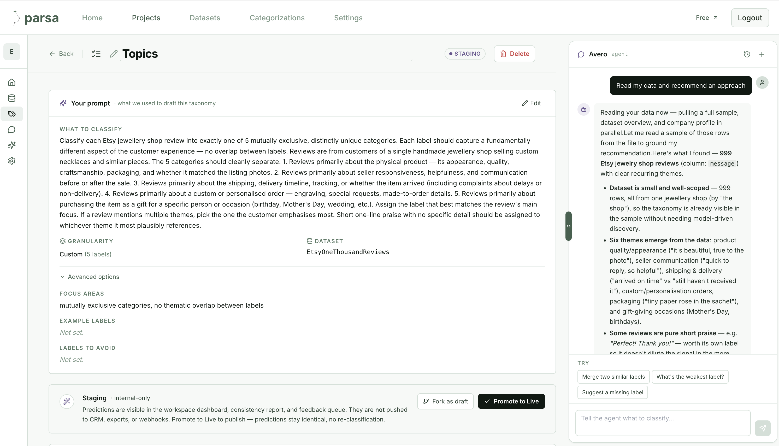
Avero samples the dataset, profiles the recurring themes, and drafts a taxonomy grounded in the actual review language, explaining what it found and why. The brief that steered the draft is kept alongside it, so the categories are reproducible rather than re-invented each session.
2 · Measure quality on every version
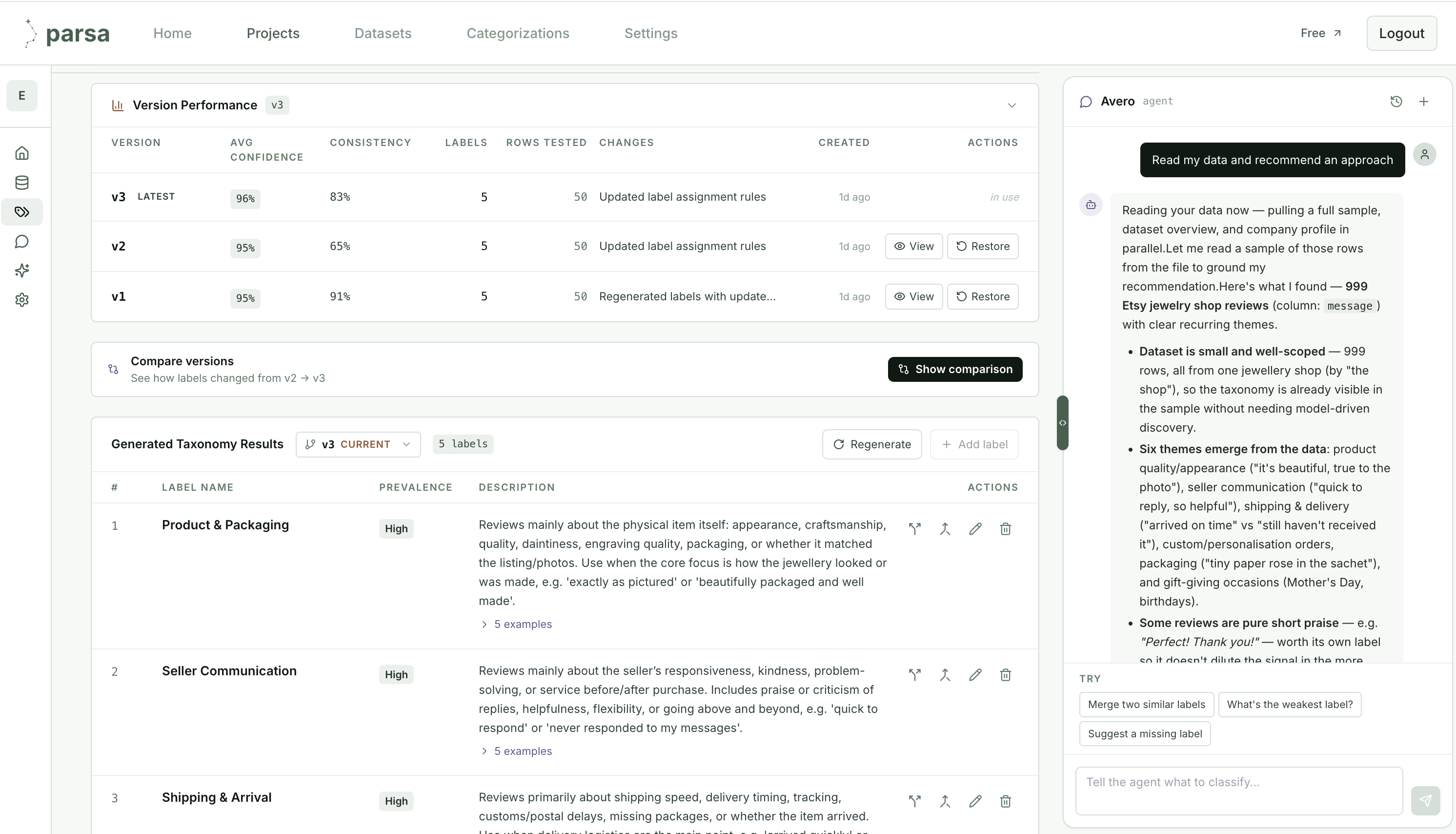
Every revision of the taxonomy is a tracked version with its own measured scores: average model confidence and a consistency score from re-classifying rows multiple times. Here the taxonomy moved from v1 to v3, and the numbers show it. v2’s rule change dropped consistency from 91% to 65%, the tool surfaced the regression, and v3 recovered it to 83%. None of this is asserted; it is measured on every version.
3 · Keep labels editable, versioned, and reusable
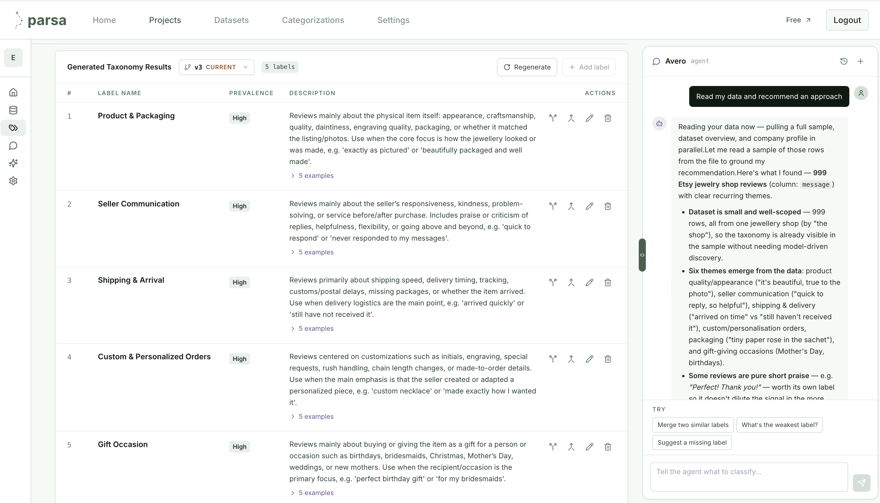
The generated taxonomy is a first-class, editable object: each label has a name, a prevalence, and a full description grounded in review language, with per-label examples. You can rename, merge, split, or regenerate, and every change mints a new measured version rather than overwriting the last one.
4 · Catch weak labels before production
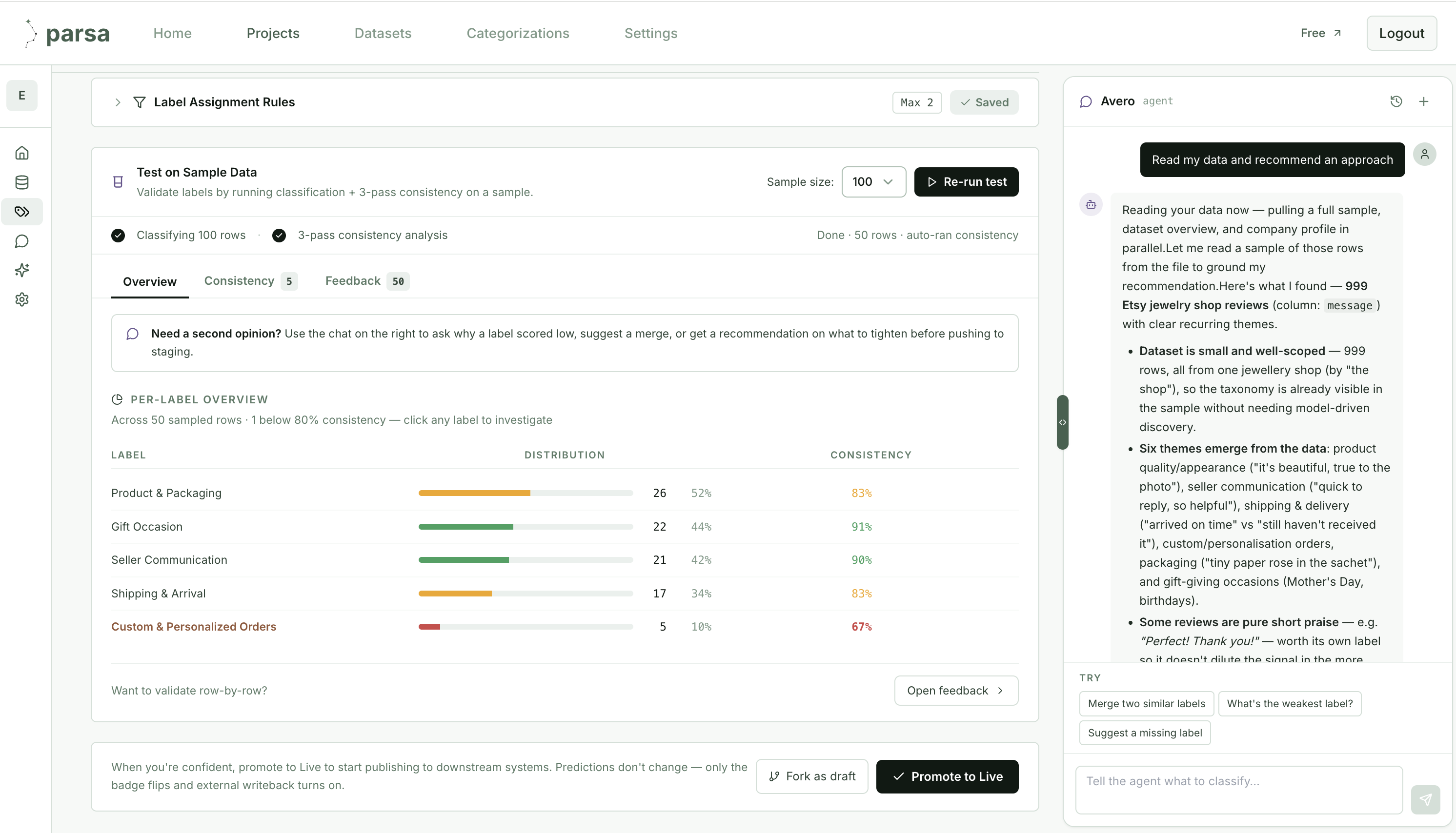
Before any label is trusted, Parsa runs it on a sample with three-pass consistency scoring, per label. This is exactly the check Claude skipped. Where Claude asserted “strong across the board,” Parsa measured each label and flagged Custom & Personalized Orders at 67%, below the 80% threshold, so a weak label is caught here, not in a board deck. Only when you are confident do you promote to Live, which turns on writeback to your downstream systems.
This is the difference the whole test was about. Claude produced labels that looked right and stopped. Parsa produces labels that are measured, versioned, editable, and validated. When a quality count informs a budget or product decision, its reliability is a number you can see and defend, not an impression created by a complete-looking spreadsheet.
5 · Move from a file to a live operating view
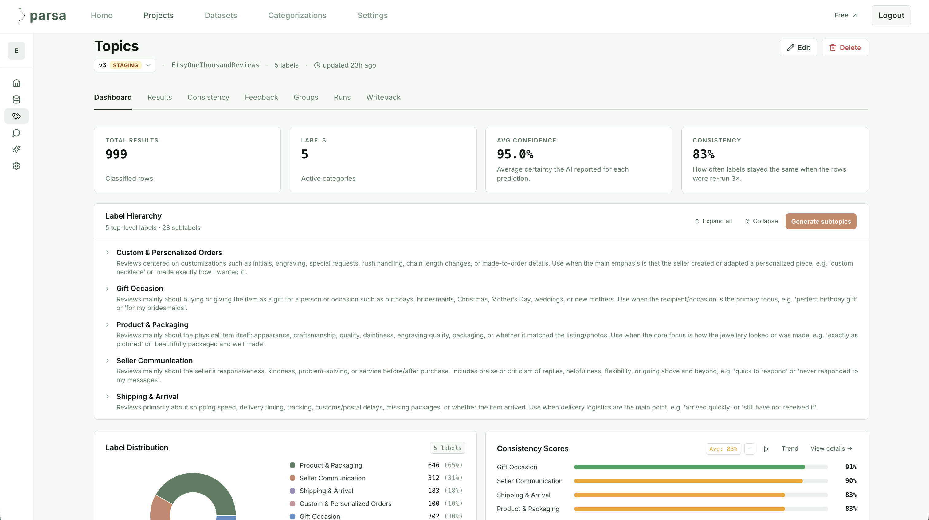
Where Claude’s output ended in a spreadsheet, Parsa’s ends in a dashboard tied to the categorization itself. Total results, active labels, average confidence, and consistency sit at the top; below them, the full label hierarchy with descriptions, a distribution breakdown, and per-label consistency scores. As new reviews are classified, these update. The view is connected to the data, not a snapshot exported from it.
6 · Add depth without rebuilding the workflow
When a top-level label needs more resolution, “Generate subtopics” breaks each one into a set of finer categories, scoped to the rows already classified into it. You steer it with a short prompt and a subtopics-per-topic count; Parsa then creates a child categorization per label and runs classification on it, the same drafted-measured-tested cycle, one level down. No new session, no new script.
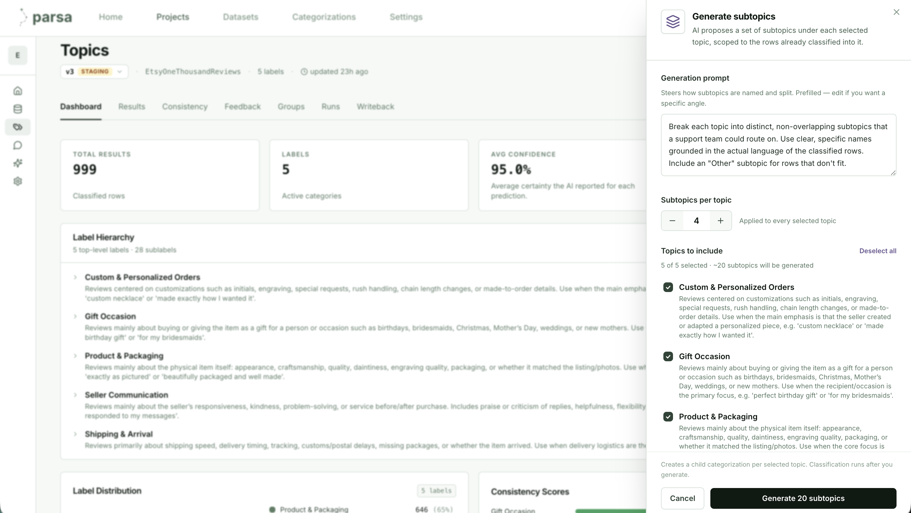
The result is a taxonomy that deepens as your questions get sharper, from five topics to twenty-plus subtopics, without ever leaving the system or losing the measurement behind each label.
7 · Analyze multiple dimensions together
A single taxonomy answers one question. Real analysis usually needs two at once. In Parsa, each taxonomy is an independent, versioned categorization on the same dataset, so you can run more than one and combine them. Here the reviews carry both a Topics taxonomy (five labels, plus subtopics) and a separate Sentiment taxonomy (Positive, Negative, Neutral), each measured on its own, at 84% and 95% consistency.
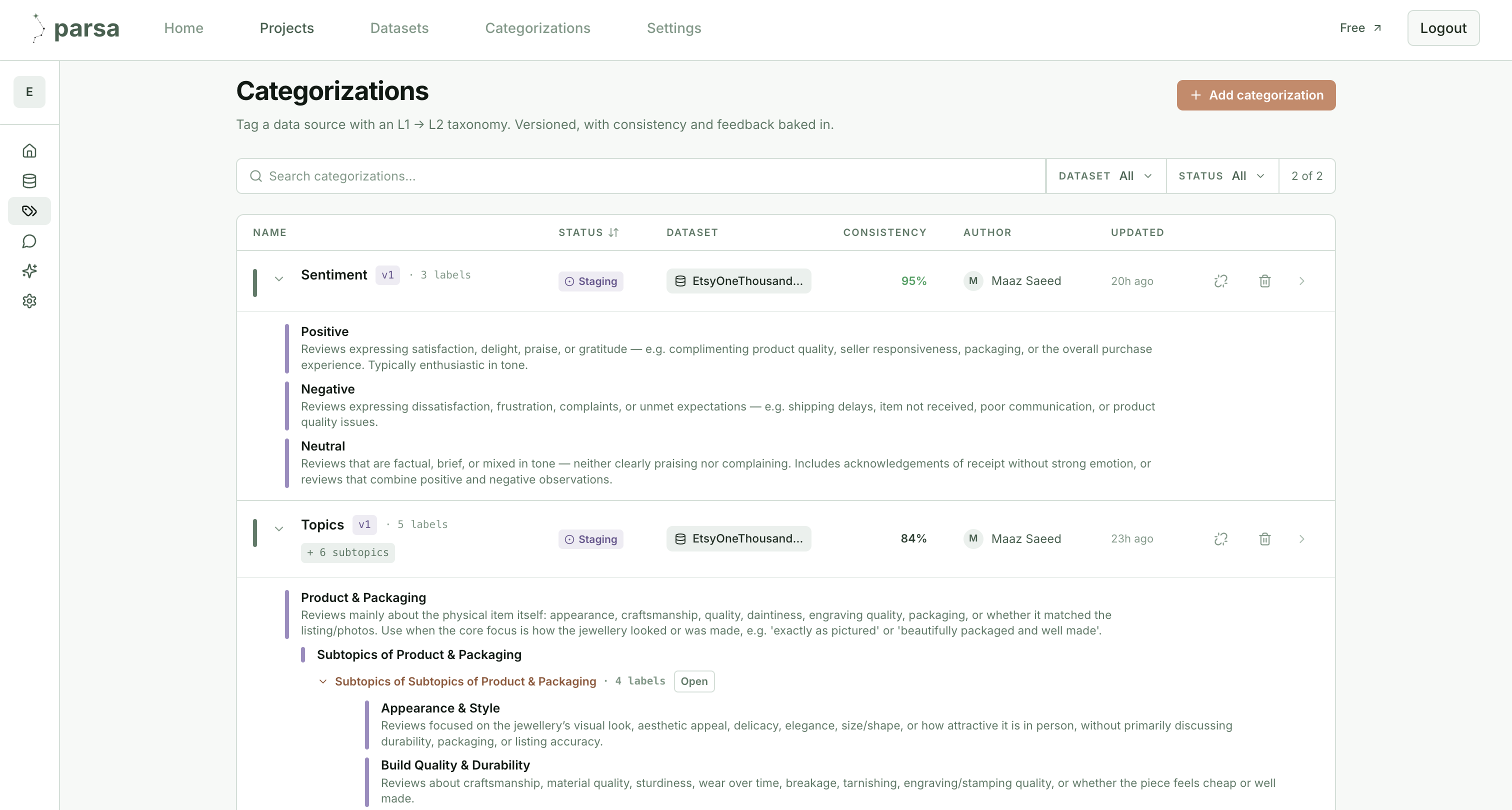
With both in place, every review carries a topic and a sentiment, and questions that were impossible in a single flat spreadsheet become a filter: which topics drive the negative reviews, whether shipping complaints are getting worse, how sentiment splits within Product & Packaging. This is the multi-dimensional slice a keyword workbook cannot produce. It had one column of labels and no measured second axis to cross it against.
8 · Keep insights current and traceable
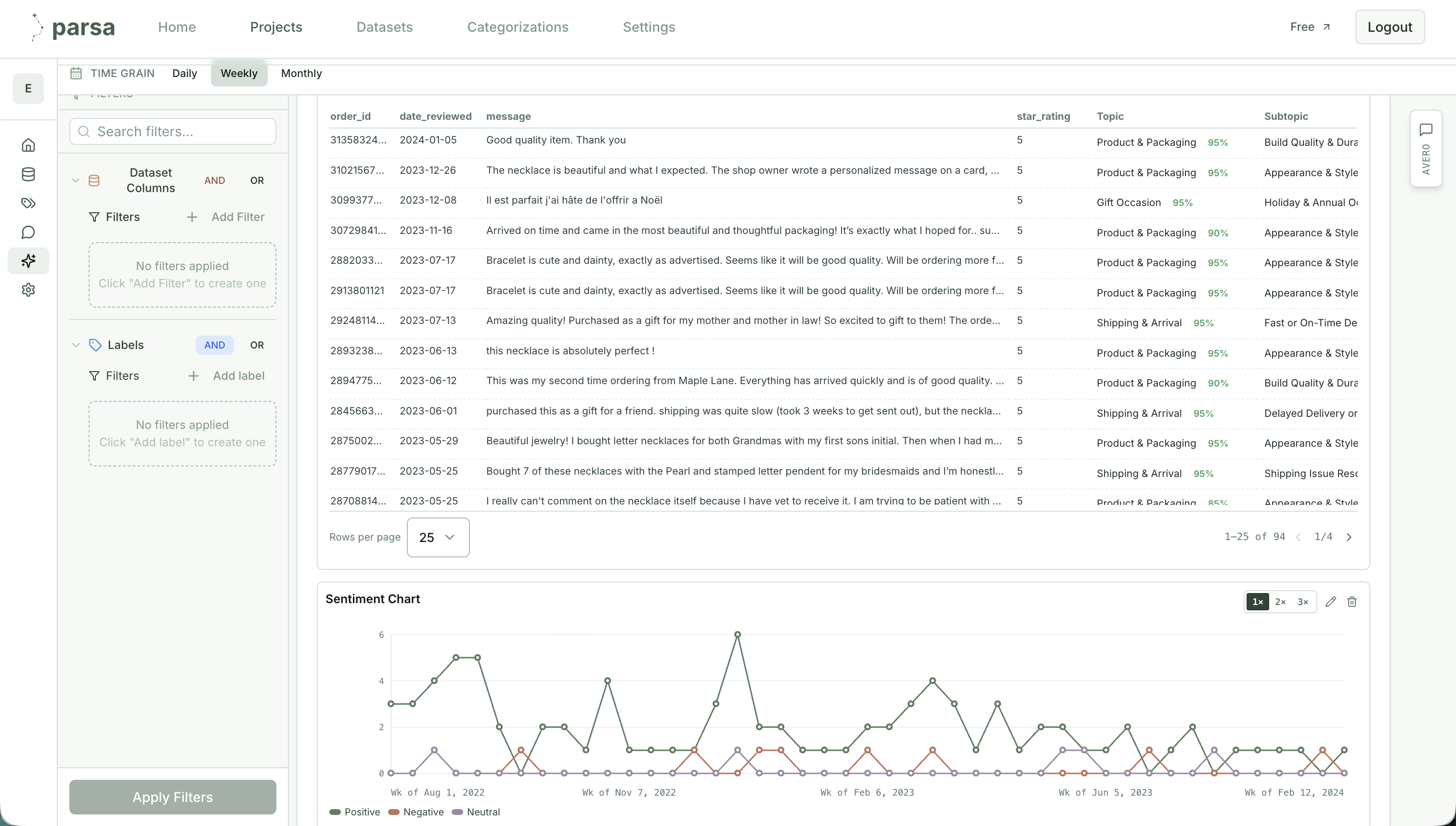
The endpoint is not a file but a dashboard tied to the categorizations. It reads the classified reviews directly, filters by any dataset column or label, and rolls up daily, weekly, or monthly. Because it is connected to the data rather than exported from it, it stays current as new reviews are classified, and a published version holds each figure fixed so the numbers do not shift underneath a reader.
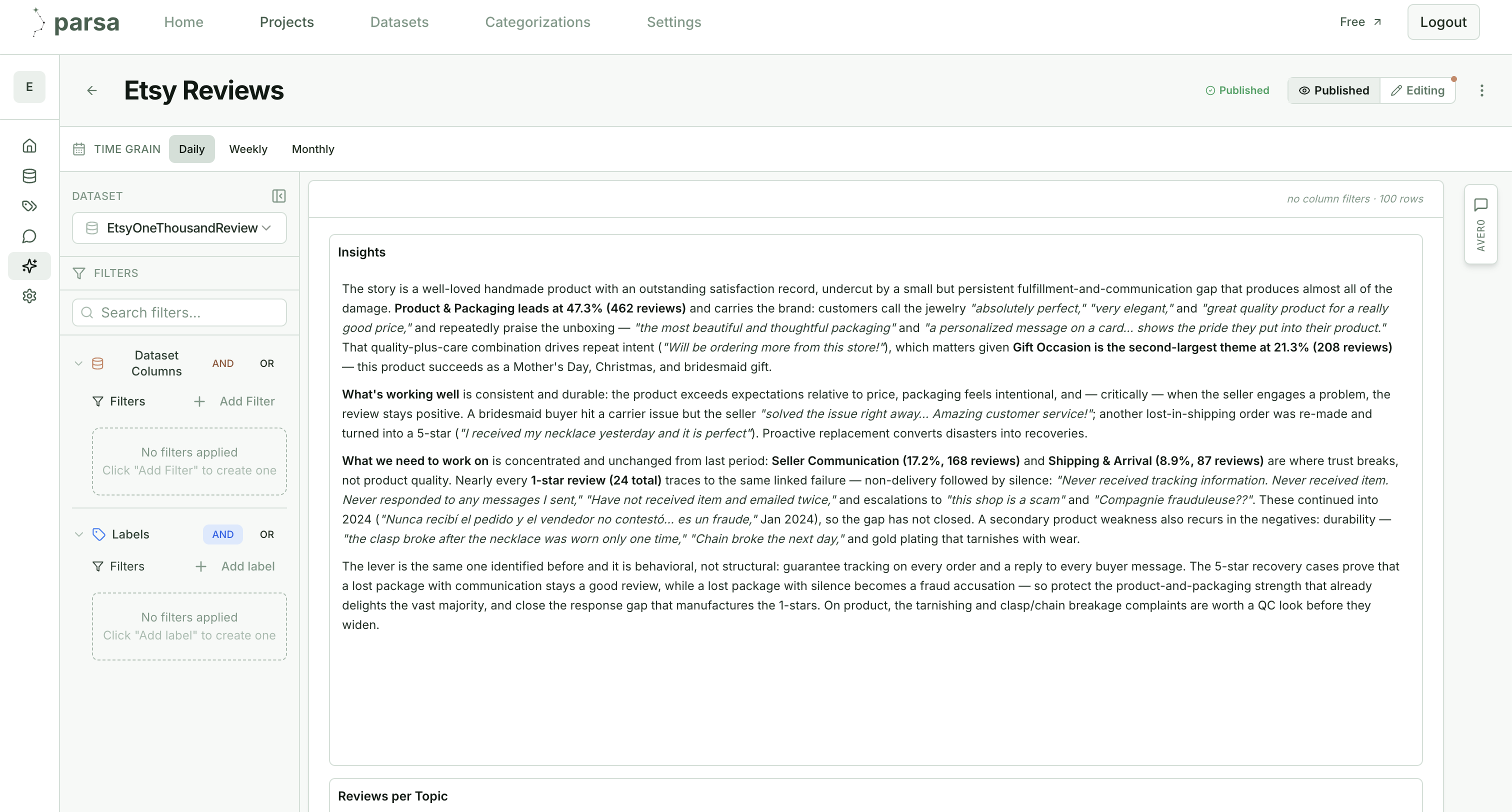
The narrative is generated from the measured labels and grounded in real review text: 87.9% five-star, Product & Packaging as the dominant theme, durability and shipping as the concentrated risks, with the exact quotes behind each claim. Alongside it, charts break the same data down by topic, each with its own live AI reading.
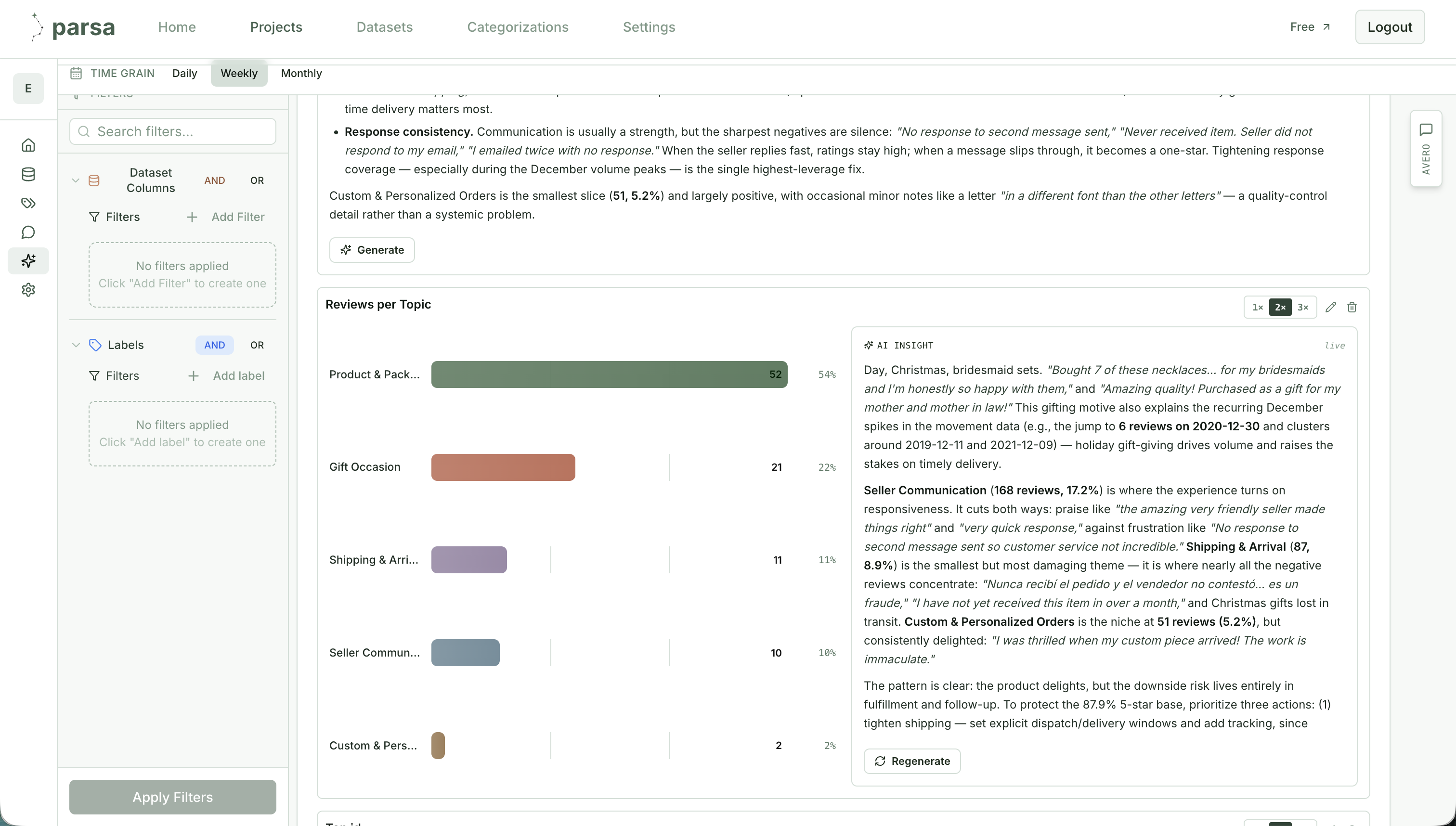
And every number stays traceable to the row it came from. The tabular view shows each review with its assigned topic, subtopic, and confidence, while a sentiment trend chart tracks Positive, Negative, and Neutral over time: the seasonal spikes, the December gift rushes, the weeks where negatives cluster.
This is where the two paths fully separate. Claude produced a spreadsheet of labels whose accuracy was never measured and which could go nowhere. Parsa produces measured, versioned labels across multiple dimensions, feeding a live dashboard that filters, trends, cites its sources, and stays current. That is the difference between a one-time artifact and a system a team can run on.
What the test showed
The lesson is not that coding agents cannot produce useful analysis. It is that polished output can create confidence before the underlying method has been verified. Here, the clean summary made Appearance look like the 32.9% priority and Quality like the 9.7% issue to deprioritize, while real durability complaints were hidden in design, shipping, and service categories. The output failed silently and confidently.
When AI-generated findings inform customer priorities, product decisions, or executive reporting, accuracy and consistency cannot be assumed. They need to be measured, audited, and repeatable on new data. A spreadsheet that is obviously broken invites scrutiny. One that is complete, polished, and wrong can ship the decision.
The simplest version of the problem
This exercise was the most contained form of the task there is: one static file, a thousand rows, a single pass, run once on a laptop. A real deployment looks nothing like it. In production, text analytics has to:
- →Run against live connections to a ticketing platform, a social feed, and internal databases.
- →Score new records as they arrive, not once against a fixed file.
- →Fire downstream actions through webhooks, continuously, and under access controls.
If a coding agent’s output needs this much scrutiny on the simplest version of the task, the gap only widens at production scale. Parsa is the platform purpose-built to run text analytics at scale, reliably and securely, for enterprises.
When did you last audit your AI-powered systems for consistency and accuracy?
Evaluate Parsa on your own data and get expert-grade insights in less than 30 minutes.
Evaluate Parsa on your data →